Springtime!

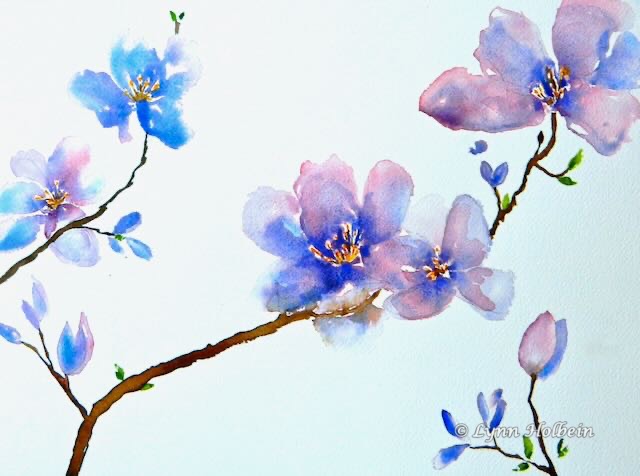
The buds are getting fatter and fatter until they burst open. The best time of year.

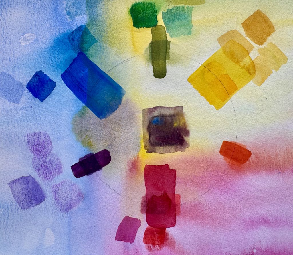
If pink and blue had been mixed together evenly on my palette before painting, these dogwood petals would be uniformly lavender. But instead I painted each shape with clear water, then dropped in blue and pink separately, with uneven amounts of each color. More interesting, don’t you think?

Less is More

When making a quick sketch, you have to choose. What do you like most in the scene, and what could you eliminate? Compare this photo to my sketch, done in 15 minutes sitting on a bench at the NC Museum of Art last Friday. What is included, and what is left out?

Color Basics: Warm vs. Cool

One important element of colors is their warm or cool nature. Warm colors (think fire) are RED, orange and YELLOW. Cool colors contain BLUE (think ice and cool water) and are purple, BLUE and green. This homemade color circle shows several shades of each PRIMARY and secondary color, each “leaning” toward its neighbor. For instance, on the circle on the upper right, there are three small purples. The top one leans toward red and is therefore a “warmer purple”, while the lowest leans toward blue and is therefore a “cooler purple.” Make sense?

Color Basics

Dusting off my art teaching (many years for pay, mostly with women, and 19 years volunteering to teach men in prison), it occurred to me that you might enjoy some basic art principles, which I will send over the next several Mondays. Here’s a homemade color wheel. There are only three primary colors: red, yellow and blue. When combined, they produce three secondary colors: orange, purple and green. When all three are combined evenly (in the middle), they make brown or black.

Minis: Island on a Lake

“Just ten minutes a day of art” is my intention, but it seldom happens. Starting feel intimidating. Cutting watercolor paper into 2 inch squares seems to help. No big investment, how bad can it be? Here are four versions of the same imagined subject from last week.