The beauty of the autumn leaves is some compensation for the shortening days.
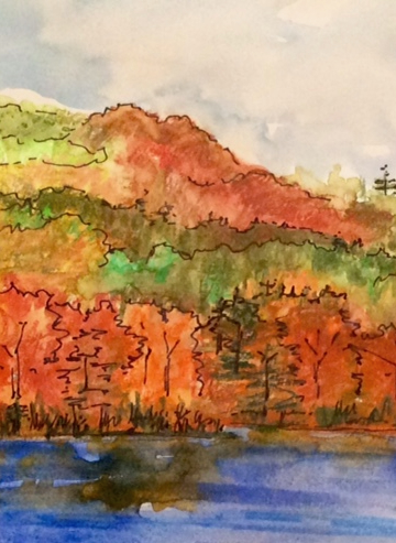
The beauty of the autumn leaves is some compensation for the shortening days.
Why do people, even experienced artists in other media, both love and fear watercolor? This little painting, done as a doodle while I was on the phone, shows one reason. Where paint on the brush touches a previously painted, but still wet area, the colors blend into new and unpredictable combinations. This is lovely if you welcome it, but not so great if you want control.
After last week’s delay, I’m glad to be back on track sending my weekly art every Monday at 5. And don’t even ask how much I’ve spent on art supplies over the last 25 years.
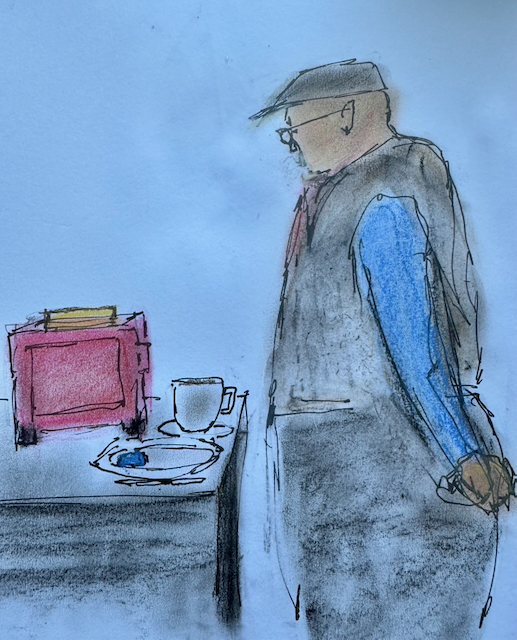
Sorry my weekly art is a couple of days later than the usual Monday at 5 — prep for a routine colonoscopy on Monday (fun!) intervened. This was inspired by an image on Pinterest, and it’s my first time trying soft pastels.
When you’re using an endlessly changeable medium like acrylics or oils, how do you know when to stop? Particularly if it’s an abstract, which could be anything? I changed many times over several days, adding layers and washing them off, scraping, using a palette knife to add texture, adding a little pen. I still have no idea if it’s finished, but it’s Monday at 5, so ready or not, I have to stop and send you my weekly piece of art.
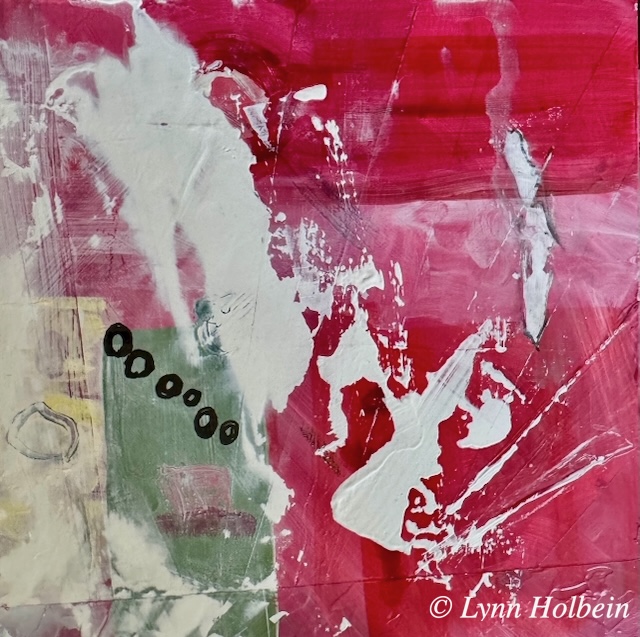
8″ x 8″ acrylics with black ink.
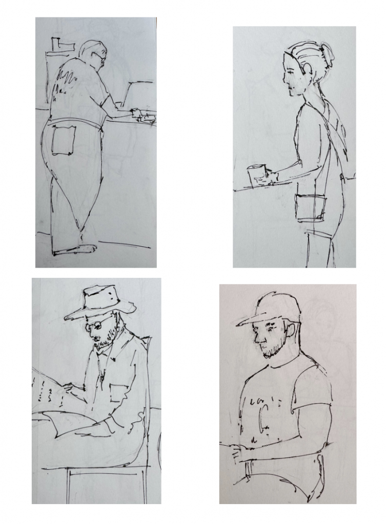
My grandmother Lila used to say, “If I ever get bored, I’ll go to a train or bus station and watch people.” Today’s coffee shops are great for people watching, and sketching is both fun and frustrating. You’re tempted to shout, “Stop moving, dammit!” Facial features are the biggest pitfall, it’s always easier if they’re facing away from you.
Having lived all my adult life in the Northeast until we moved to North Carolina five years ago, I have learned that there are regional attitudes toward the seasons. In the North, you can’t wait for summer to come, while in the South you can’t wait for it to leave. And if you’ve lived in the North, the winters in the South are no big deal.
Here is an ode to the passing summer, inspired by the style of an artist I saw in a watercolor magazine.
Watercolor. High quality prints available.
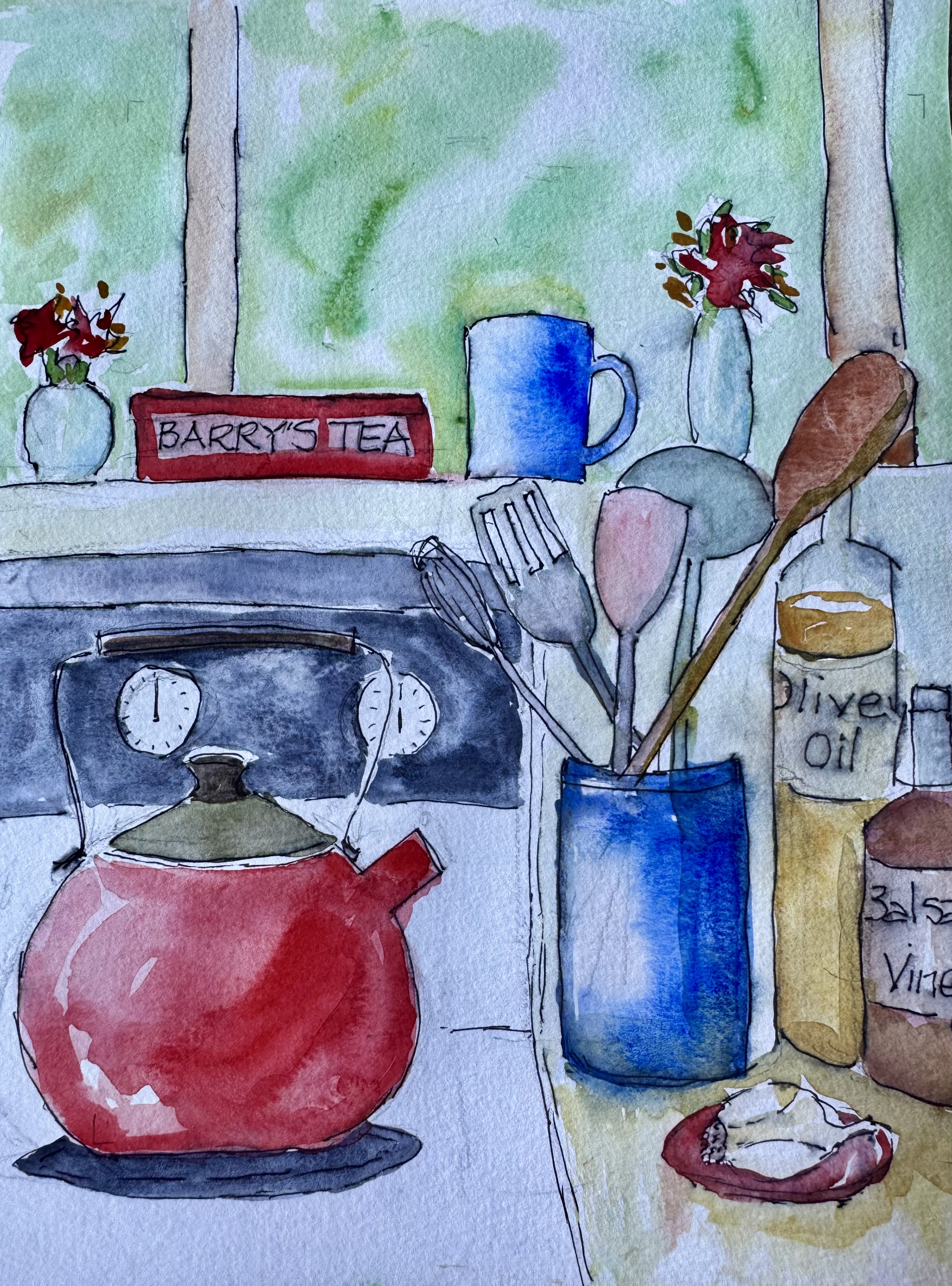
Do you ever really look at your kitchen counter? I never did, except to clean up or grab something. Then I tried sketching, which makes you pay attention on a whole different level. Here are two views. The second one, which was looser and faster, has some “see through” elements. Which do you prefer, and why?
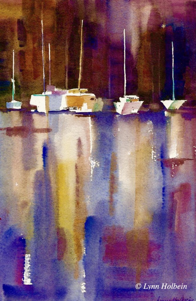
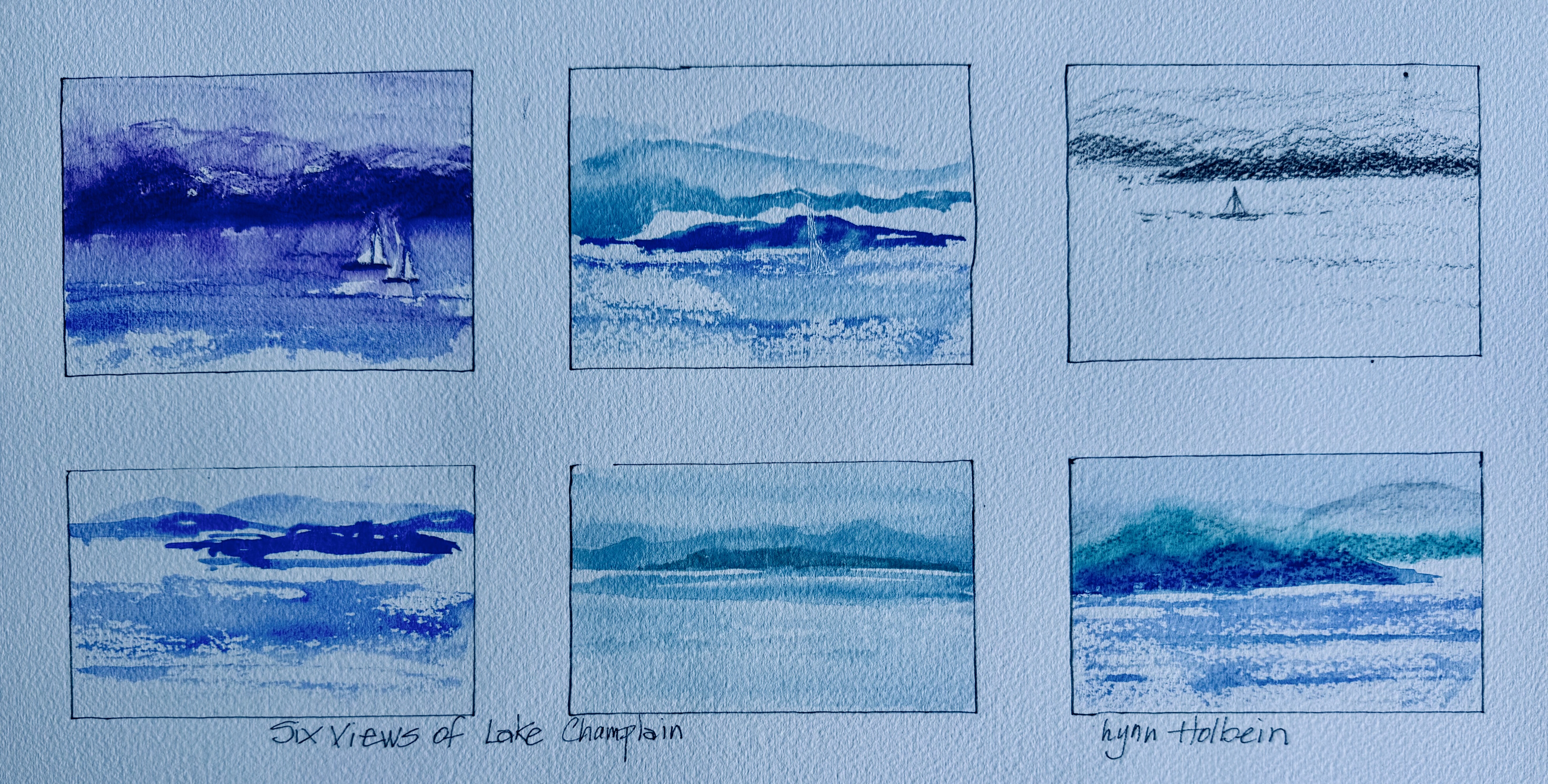
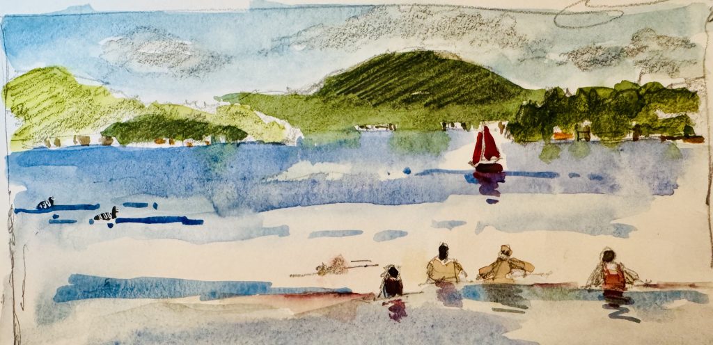
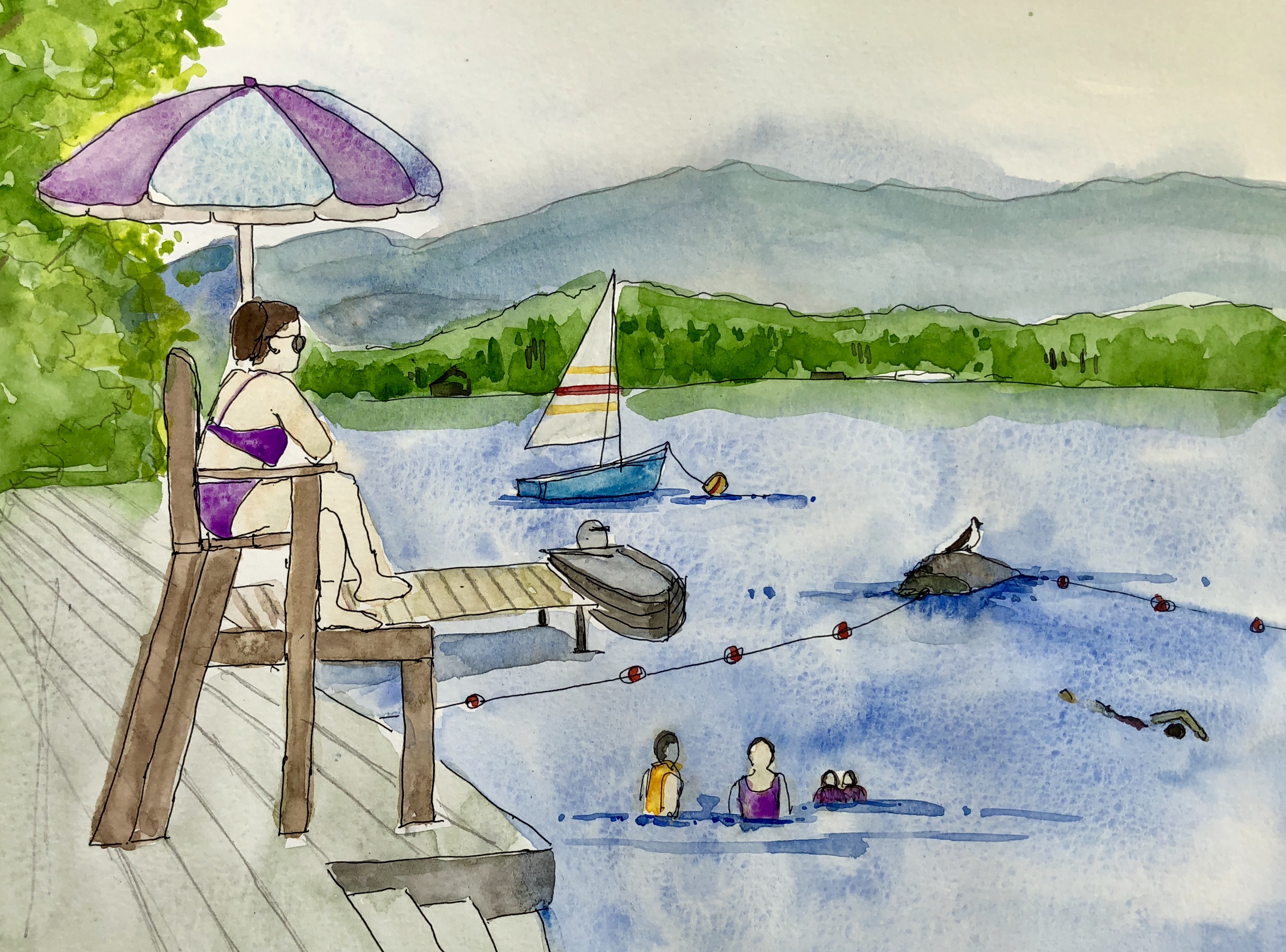
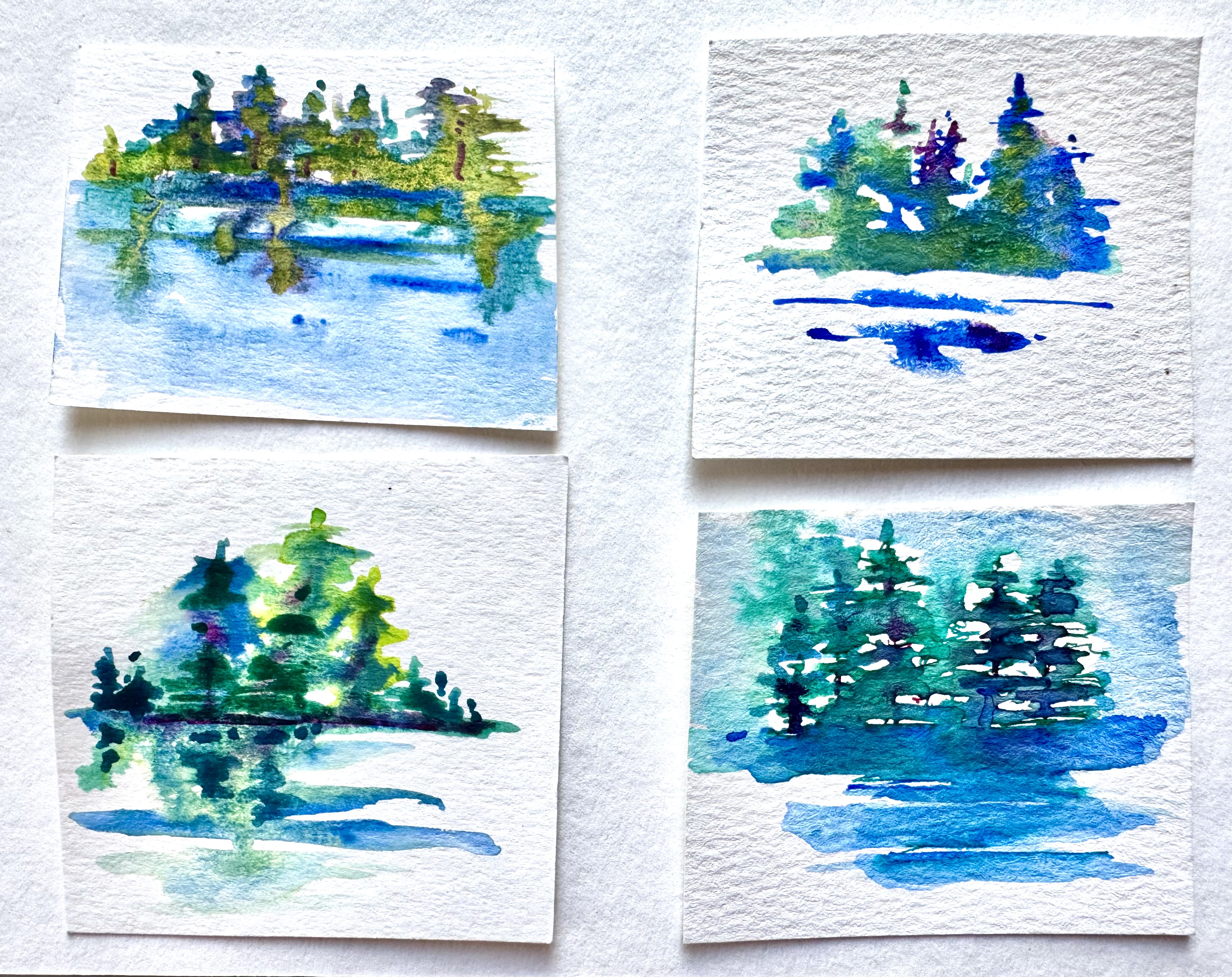
Lake Champlain is the 125 mile-long lake (the sixth largest lake in the U.S.) which forms the north-south border between Vermont and New York. Bruce and I were recently blessed to spend two weeks staying at a house overlooking the lake. Here are six attempts to capture the ever-changing view.
Watercolor, pencil, colored pencils. Pinch out for details.
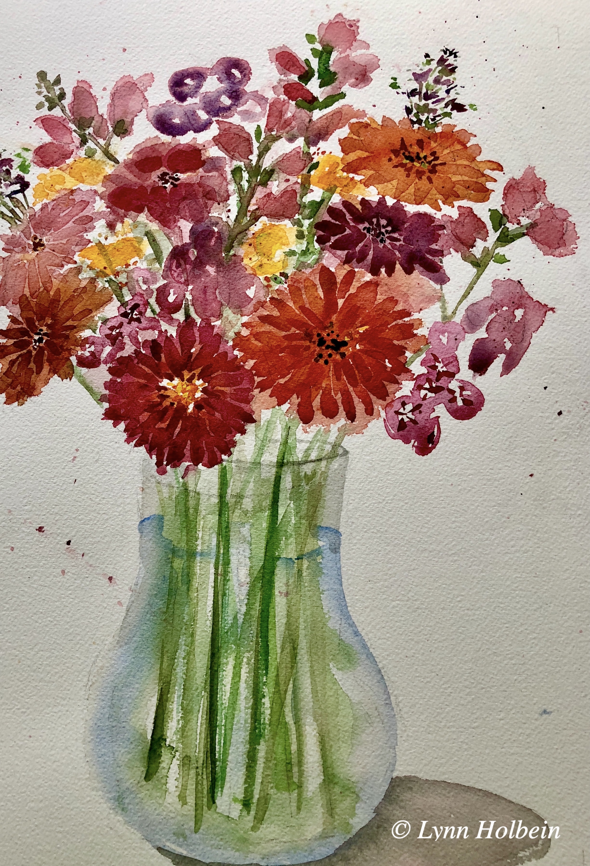
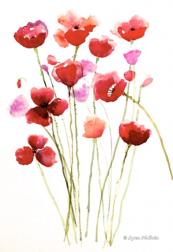
From mid-summer until late fall, zinnias bloom in a wonderful variety of warm colors.
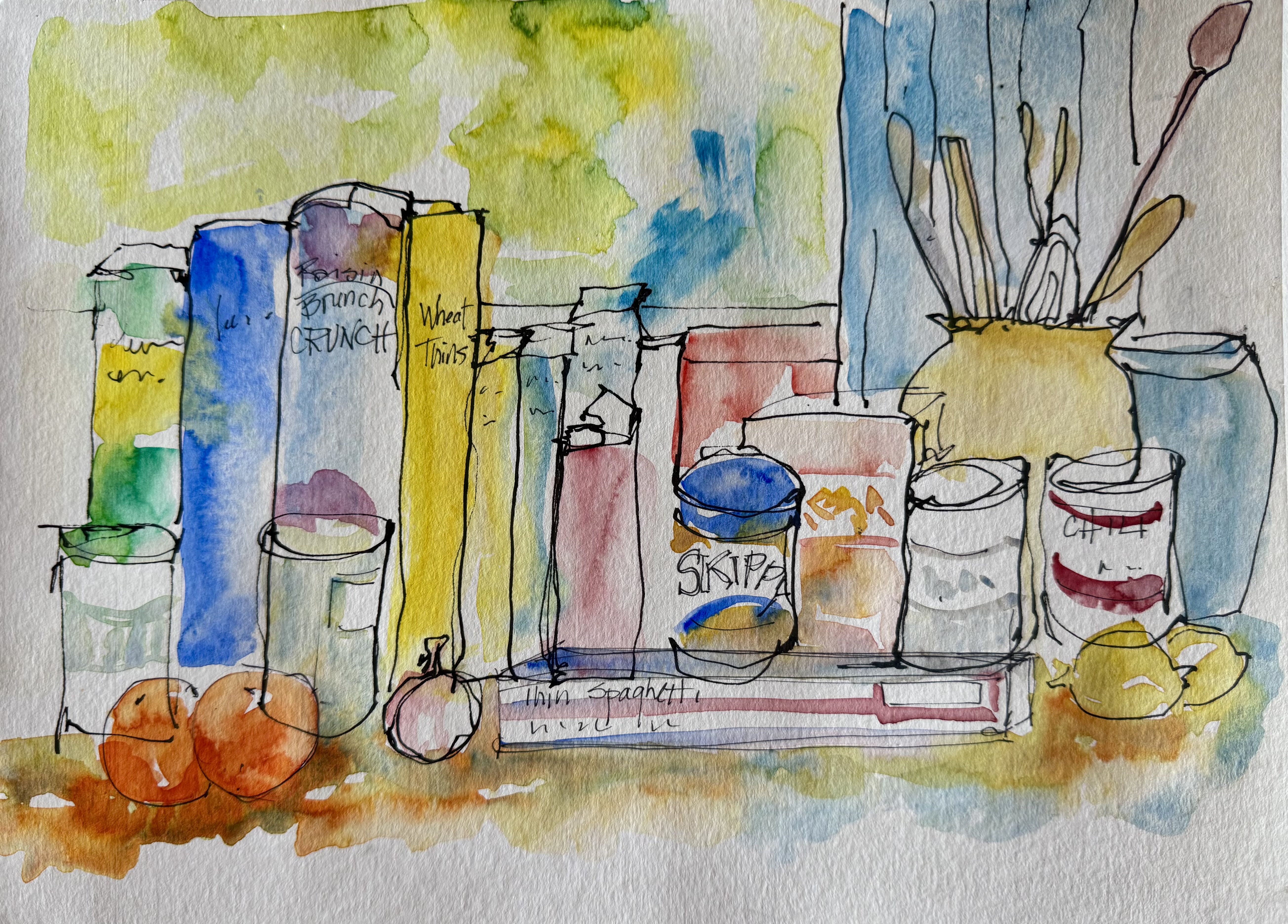
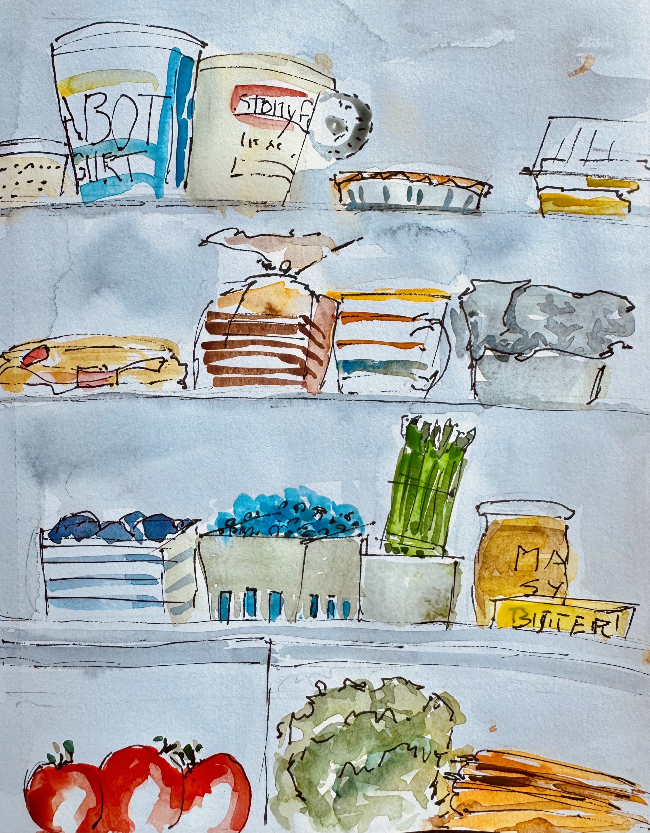
My friend Betsy, who is also a painter, is a believer in sketching everyday objects around the house. So here are the current contents of my refrigerator. Want to try it? Here are the steps: choose a subject, or a photo of your subject; loose pencil sketch, feeling free to change reality; go over your sketch with waterproof pen; paint loosely (not too much detail); sparse second layer to add shading.
Sketches like this have an immediacy not found in a finished painting. Which do you prefer? This sketch is unusual for me, because I left the pencil shading to show the clouds, rather than covering them with pen or paint.
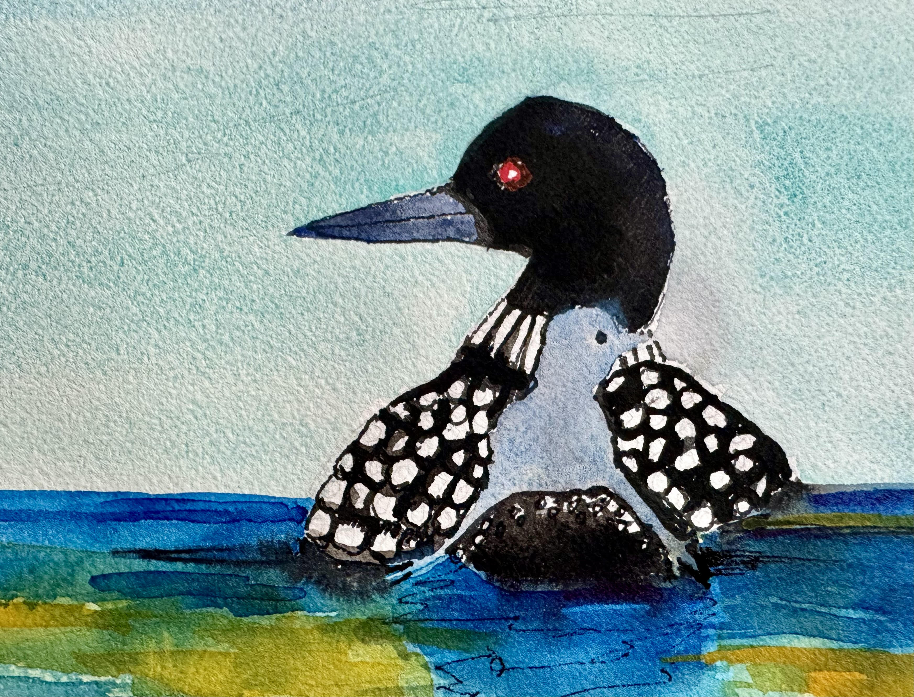
As we were leaving North Carolina to come to Vermont, a friend said she yearned to see a loon. I promised to paint one. Loons spend their summers on lakes all over New England.
9″ x 12″ original watercolor, $125.
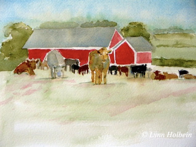
What could be more Vermont than a red barn and cows?
This is the kind of weather where we dream of scenes like this.
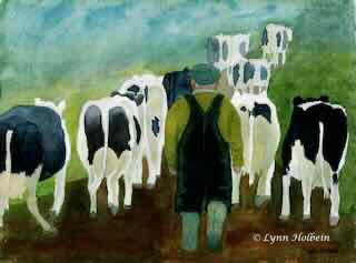
I am blessed to co-own (with my cousin) a rustic summer cottage in a little town northern Vermont, built by my cousin’s great-great grandfather in 1904. Having moved from Mass. to NC five years ago, we feel lucky to escape the southern heat and spend a couple of months just 35 miles from the Canadian border. Here’s a classic Vermont scene I painted several years ago.
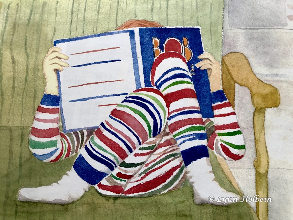
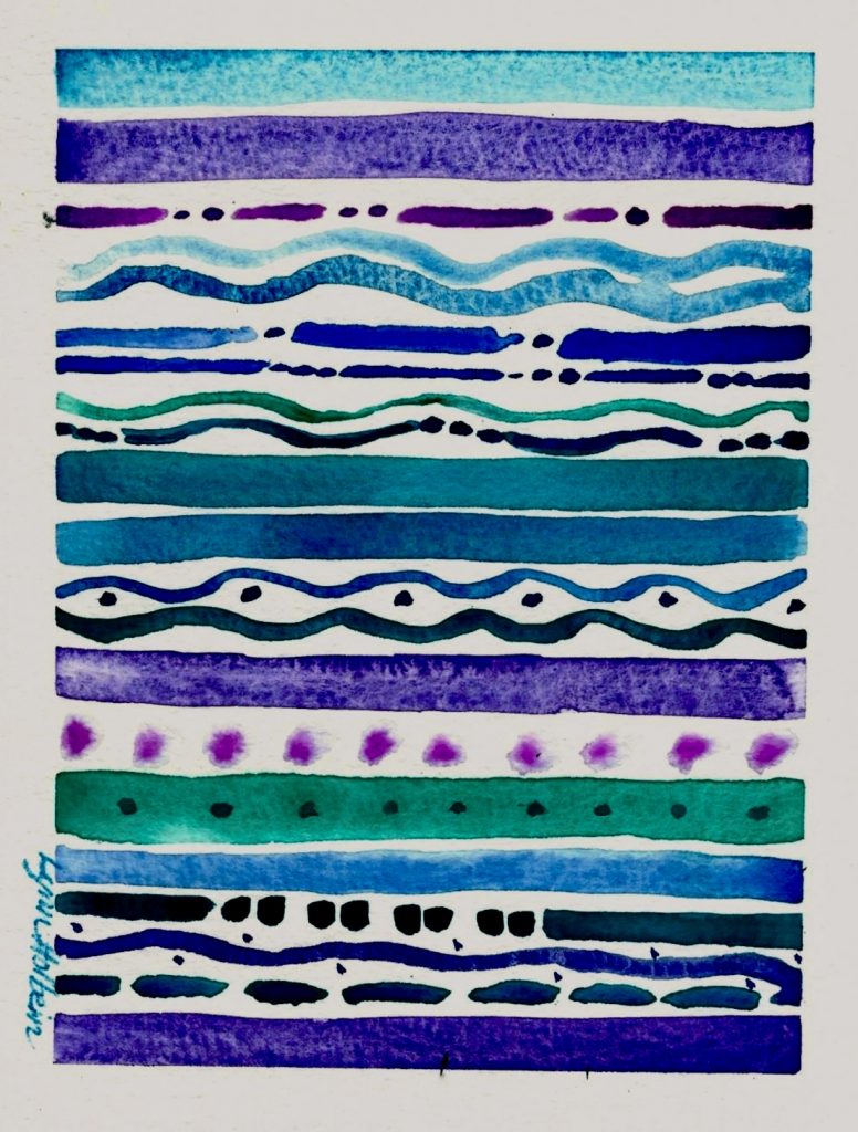
I paint every week, but I don’t always produce something worth sharing with you. So then I go back into my portfolio of 660 paintings and choose one. This week I’m packing to go to Vermont for the summer, so I haven’t had time to paint. Our granddaughter Lila is now 19 and just finished her freshman year in college. This painting shows the beginning of her literary journey. (These stripes, based on a photo I snapped, were a b—h to paint.)
Hope you are enjoying these long lingering days. And all the shades of green around us.
Connecting with nature is a great way to put the folly of humankind in perspective.
Time to start daydreaming about places like this . . .
How do you make sense of this abstract image?
Note: I chose orange to compliment the three shades of blue since blue/orange are opposites on the color wheel, so they make each other look more vibrant.
Original watercolor and ink on canvass paper, 6″ x 6″, $60.
Even though this is completely abstract, does it remind you of something?

Why do I find this life lesson so challenging?

Thanks for this idea to Brichita, an artist on Instagram.
Can you take one minute to look outside and identify five different shades of green?
Is there any time of year more glorious?

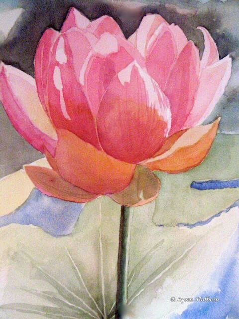
“No mud, no lotus.”
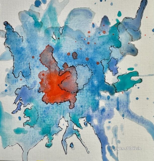
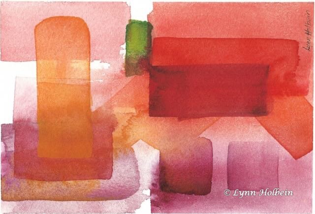
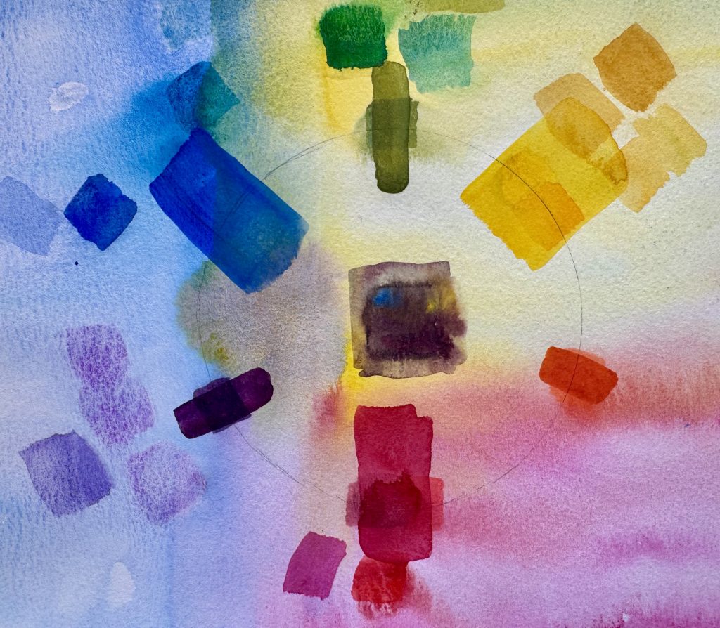
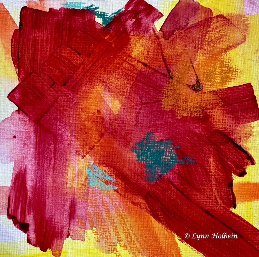
One surefire color combination for a painting (whether realistic or abstract) is to dominate with either warm (red, orange, yellow) or cool (green, blue, purple) colors, and add just a touch of the opposite. This painting is all warm colors, with just a touch of a cool color. Put your finger over the green square and see if the painting interests you more or less.
The buds are getting fatter and fatter until they burst open. The best time of year.
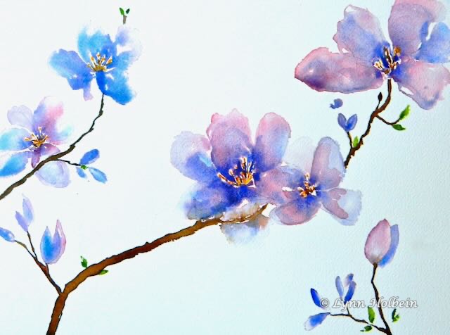
If pink and blue had been mixed together evenly on my palette before painting, these dogwood petals would be uniformly lavender. But instead I painted each shape with clear water, then dropped in blue and pink separately, with uneven amounts of each color. More interesting, don’t you think?
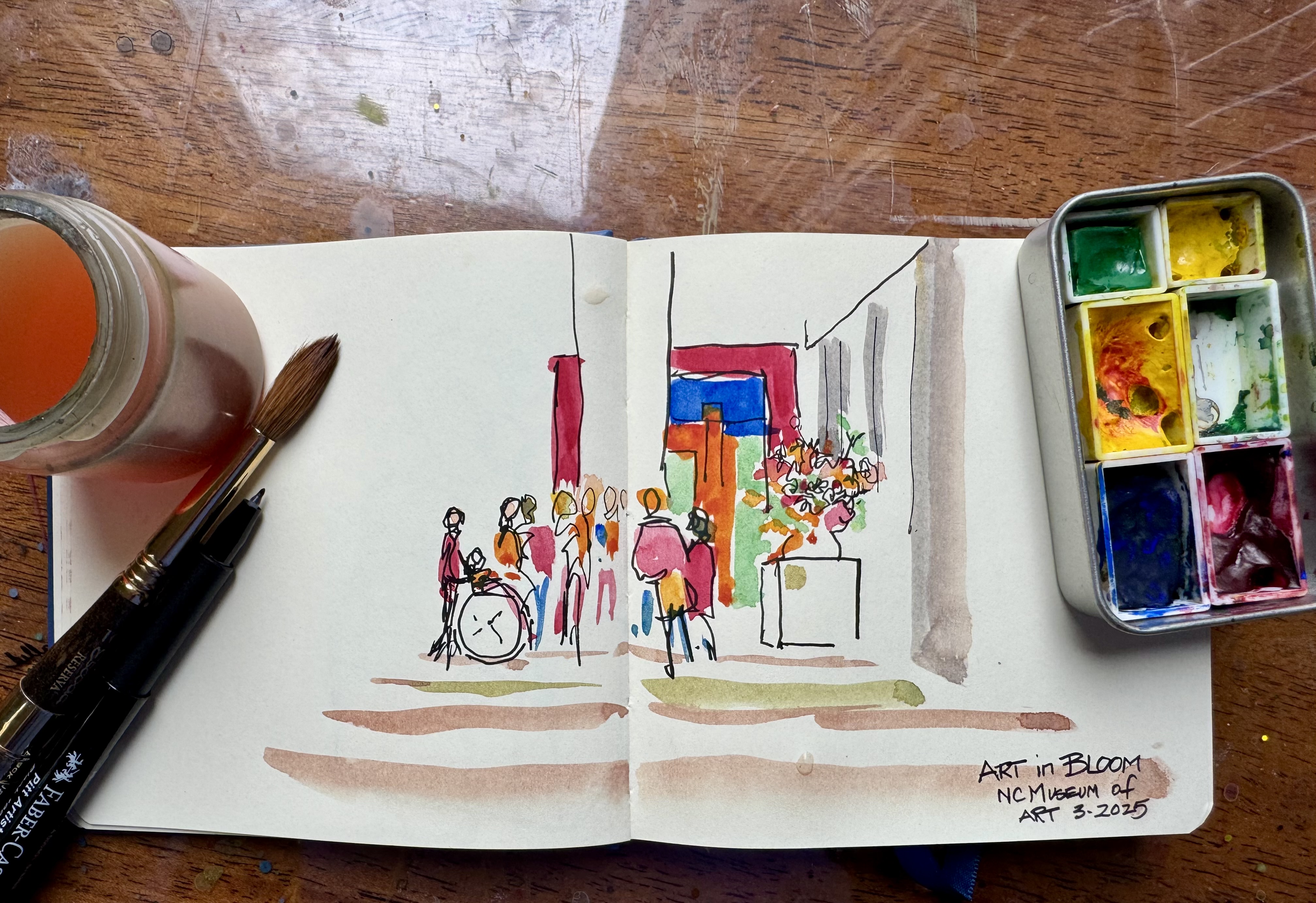
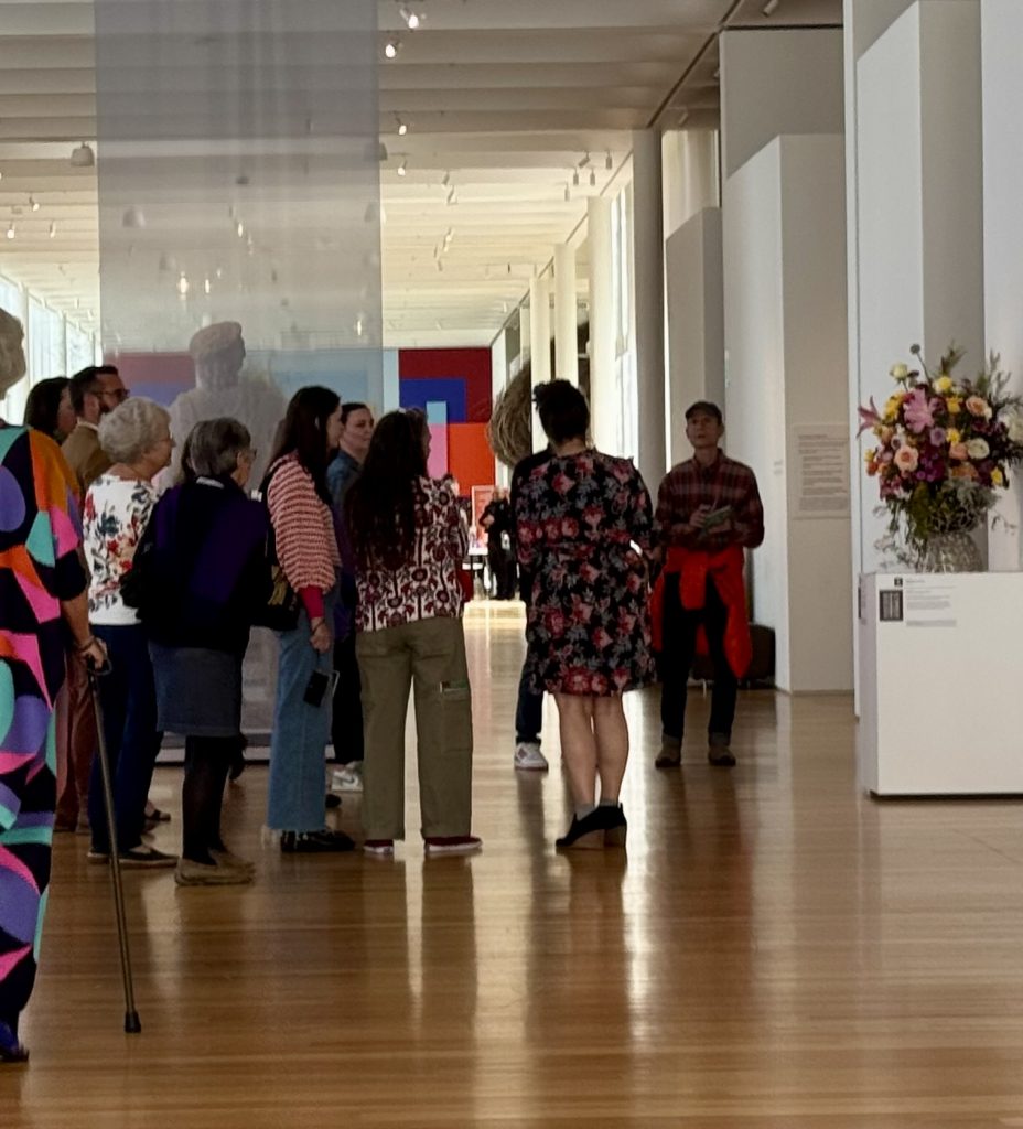
When making a quick sketch, you have to choose. What do you like most in the scene, and what could you eliminate? Compare this photo to my sketch, done in 15 minutes sitting on a bench at the NC Museum of Art last Friday. What is included, and what is left out?
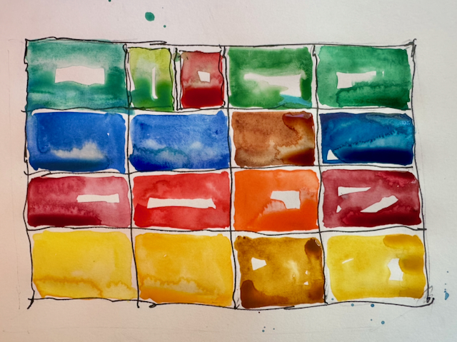
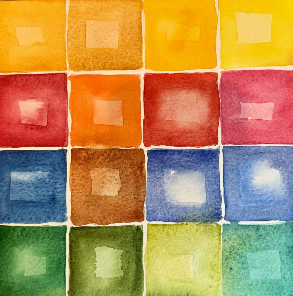
One important element of colors is their warm or cool nature. Warm colors (think fire) are RED, orange and YELLOW. Cool colors contain BLUE (think ice and cool water) and are purple, BLUE and green. This homemade color circle shows several shades of each PRIMARY and secondary color, each “leaning” toward its neighbor. For instance, on the circle on the upper right, there are three small purples. The top one leans toward red and is therefore a “warmer purple”, while the lowest leans toward blue and is therefore a “cooler purple.” Make sense?
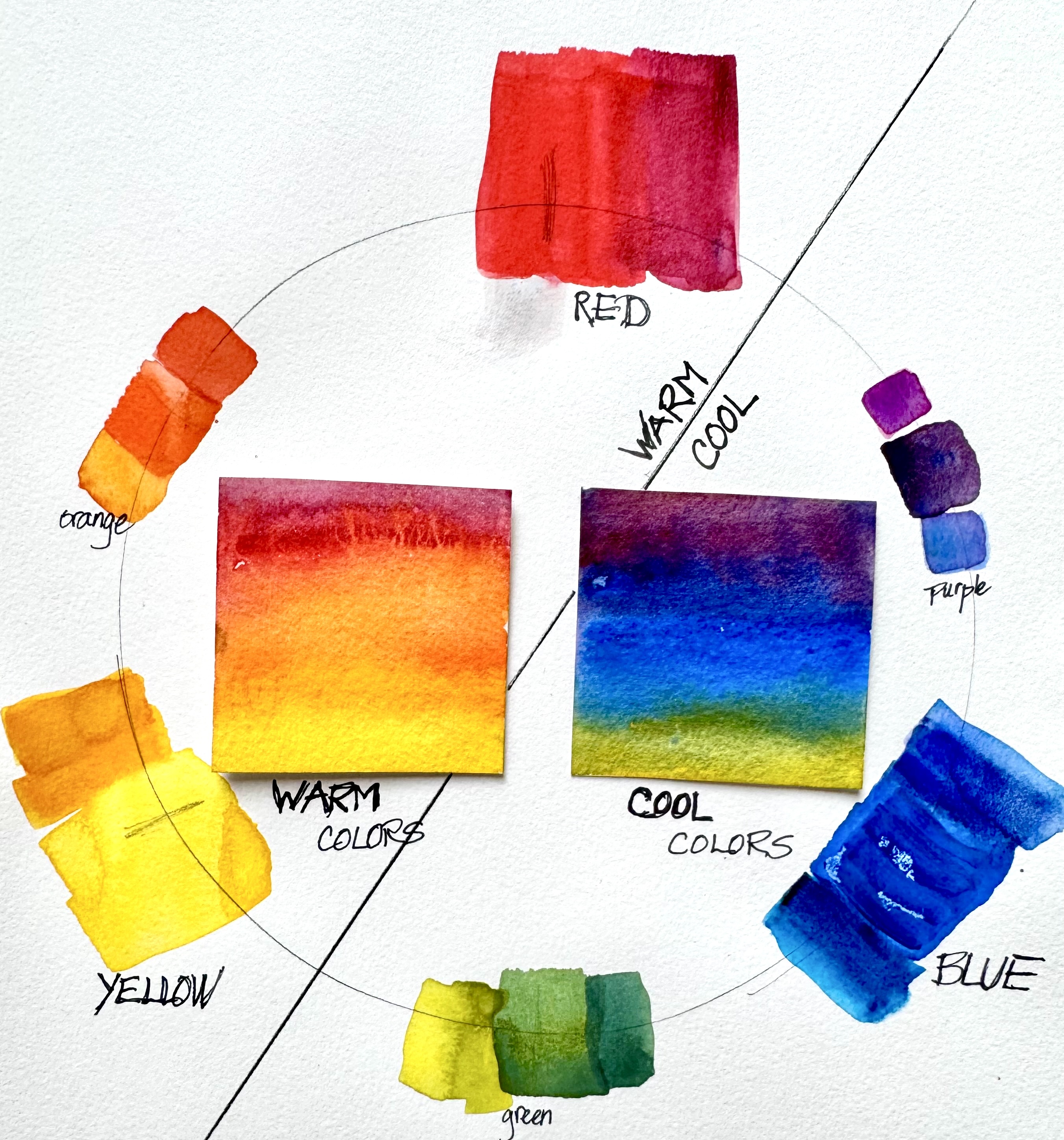
Dusting off my art teaching (many years for pay, mostly with women, and 19 years volunteering to teach men in prison), it occurred to me that you might enjoy some basic art principles, which I will send over the next several Mondays. Here’s a homemade color wheel. There are only three primary colors: red, yellow and blue. When combined, they produce three secondary colors: orange, purple and green. When all three are combined evenly (in the middle), they make brown or black.
“Just ten minutes a day of art” is my intention, but it seldom happens. Starting feel intimidating. Cutting watercolor paper into 2 inch squares seems to help. No big investment, how bad can it be? Here are four versions of the same imagined subject from last week.
Thanks to everyone who suggested serious or whimsical titles for my abstract last week. Some of the funniest: “Potholder in process,” “It’s five o’clock somewhere,” and “Placemat after dinner and it’s time to clear the table.”
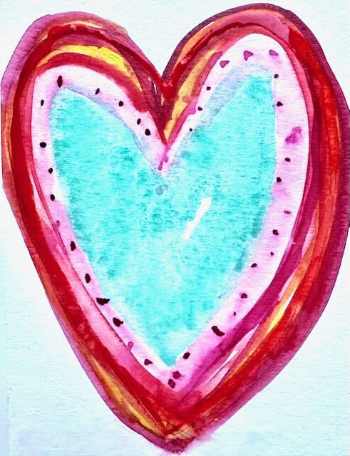
Isn’t it always a good day to express gratitude to those we care about?
Titling abstracts is a dilemma. Should I call this “Abstract #134”? or “Red and Turquoise on Yellow”? or “Sunset with Turquoise Moonrise”? Your advice welcome.
Acrylics, watercolor and pastel.
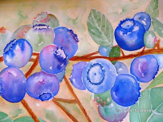
I painted this in the fall, inspired by a neighbor’s bush and all the shades of the ripening blueberries. I post it now because having cataracts is like wearing amber sunglasses; after mine were removed last month, the blues especially seem more vivid.
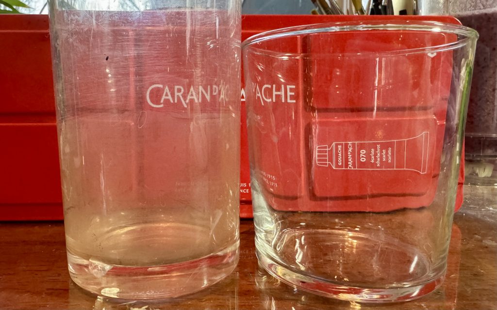
Over the last three weeks I have had cataract surgery on both eyes at Chapel Hill Ophthamology. It’s amazing — the world is so much crisper and more colorful! The photo below is like my vision before and after; before, it was like looking through a used plastic glass, and now looking it’s like looking through real glass.
Below that photo is a painting of my current 16-color watercolor palette.
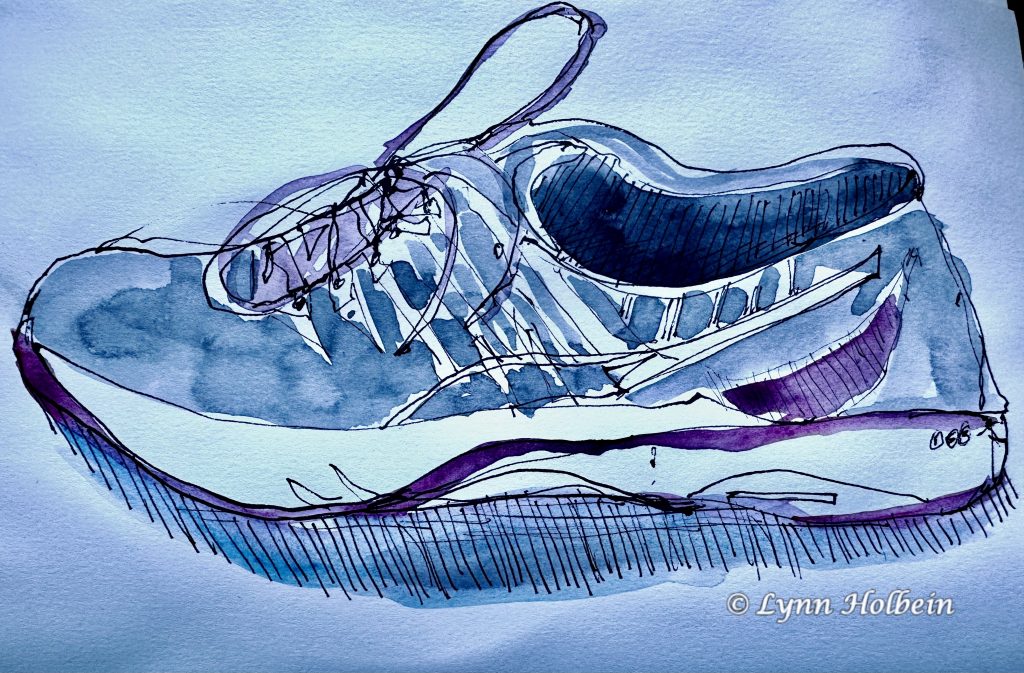
This sketch was fun to do. Try it yourself? Hatching and cross-hatching are good ways to show a shadow and make a object feel “grounded.”
Here’s a link to a 4-minute video of Jane Fonda, age 86, with secrets of living longer and happier, including taking art classes.

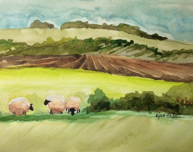
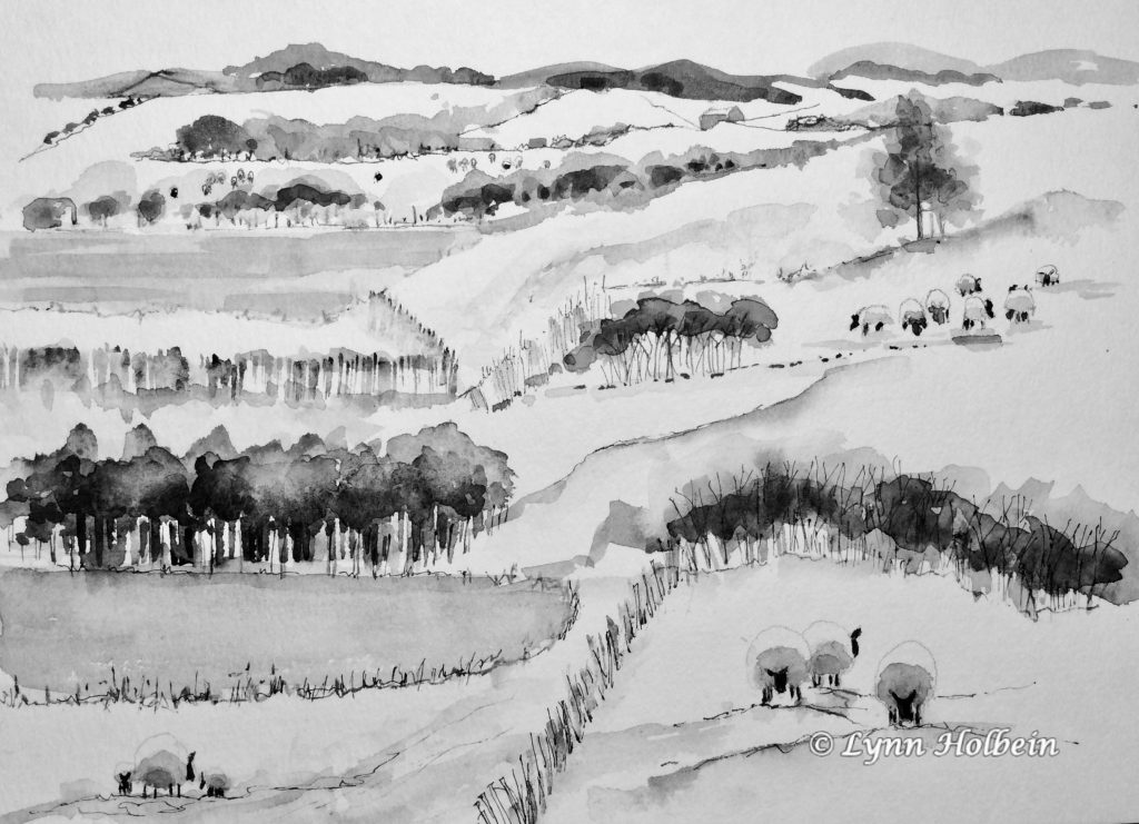
Patchwork fields are so appealing, like those found in the British Isles. I saw a painting similar this and decided to try my own version. This was done with ink and black watercolor paint, diluted to produce a range of grays.
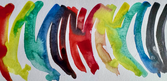
For the New Year, I’m doing a series of ten minute exercises: bubbles, grids, shapes and spirals. Try setting a timer for ten minutes and see how it feels!

Bruce and I wish you and yours a happy, healthy year ahead!
Wishing you and yours a blessed Christmas and Hannukah!

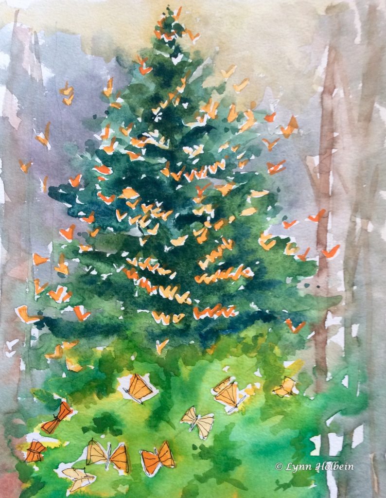
This “Christmas tree” is covered with monarch butterflies emerging from their chrysalises in the forest in Mexico. I painted this a decade ago when I visited this site; it came to mind when I read that monarchs are now considered a threatened species. Monarchs need milkweed to reproduce, so we are planting some in our backyard. See this link for how you can help.
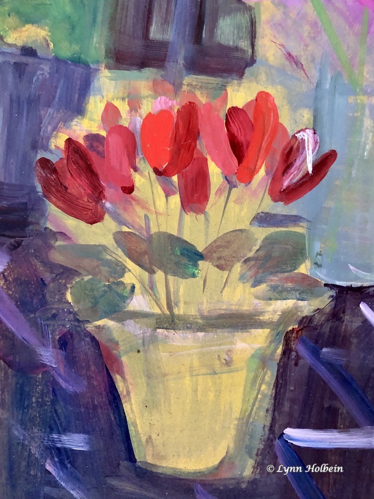
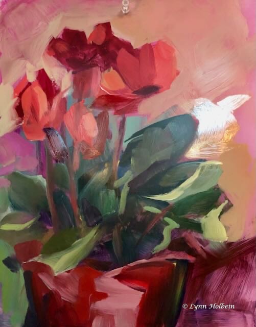
Red and green are my favorite colors, which is fun at Christmas time. Here are two versions of the same cyclamen, painted in an acrylics class taught by Lisa Daria Kennedy. She taught us how to use thin layers of paint to produce a more luminous quality.
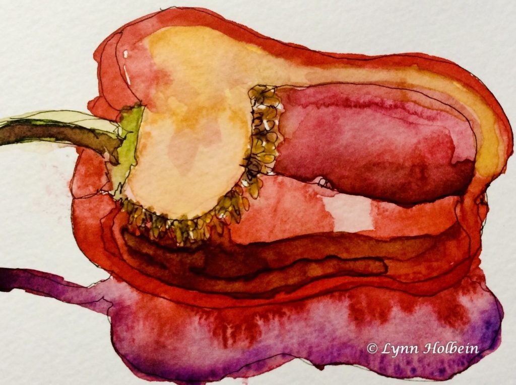
How often do we buy, cook and eat vegetables without really seeing them?
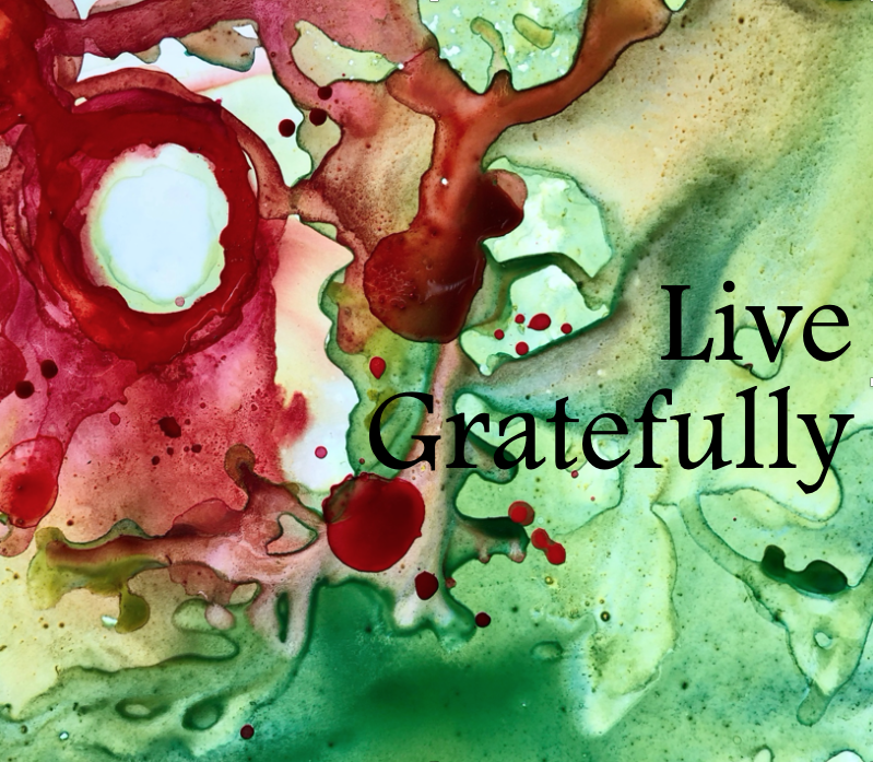
Research increasingly shows that, even though we have problems, counting three gratitudes each day makes us happier and healthier.
Watercolor on yupo paper.
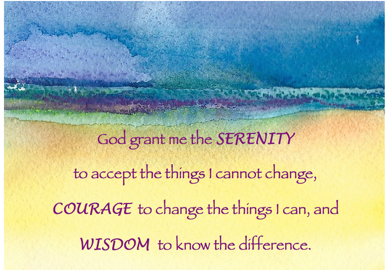
At times when some are distressed, and others are relieved, the wisdom of the Serenity Prayer is universal.
77% of Americans on both sides say they feel election anxiety. At times of personal (and national) anxiety, deep breathing helps. In ocean breathing, we visualize a wave hitting the sand as we breathe out, and receding as we breathe in. Try a few breaths like this and watch your body and mind relax.
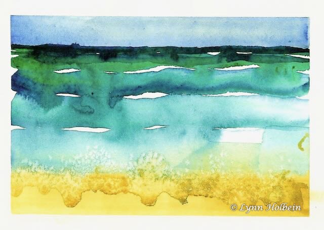
Kosher salt dropped into wet paint created the sand effects.
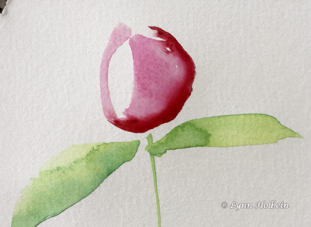
This painting took just four strokes. Then, wisely, I stopped.